Wednesday 28 October 2015

Taking Notes With Ian


Here are some notes and rough illustrations that I got from yesterday morning's lecture with Ian. Ian gave us all some good tips and advice on professional filming, and hopefully these shall come in handy when I make my own documentary.

Tuesday 27 October 2015

Documentary Planning


On Monday I began planning out how I would construct my documentary video. I included possible questions and interviewees which would help generate a flowing conversation. I have even considered taking on a variety of camera angles, so that the whole video won't be too boring or monotonous to sit through; it would also depend on who the interviewee is and how they appear to me.

That night I watched two documentary movies: The Miners Campaign Tape and WWE Unauthorised. As I watched, I took notes on how each shot stood out and what they each did to keep the entire thing consistent and fitting to the context. I now feel more prepared and know better which way to operate my camera for filming.

Saturday 24 October 2015

Natural Textures


On Thursday night I went for a walk over Tooting Bec Common, taking photos of any natural textures I could find, such as tree branches and park benches. Because many concept artists have to be as convincing as they can, I figured that a variety of textures was paramount to perfecting such realism. Among these illustrations there are elements such as foliage, rocks, wood, rust, worn-away brickwork and pathways.

Friday 23 October 2015

Foundation Diploma Specialist Lanyard Design


Each student across Ravensbourne has a different coloured lanyard dependant on which subject they're studying. When we got ours, we had the option to decorate them in our own way. Using a pen and my set of coloured dual brush pens, I set about laying out a series of dynamic shapes and structure across both sides of the lanyard. They weren't supposed to mimic anything in particular; I thought it would just make it look more particularly art-based.

Tuesday 20 October 2015

Ravensbourne Big Draw


My two ideas for my postage stamp, based off of Tim Burton and South Park. I aim to finish them both through PhotoShop. I decided to scrap Fallout 4 because I felt it was the least stylish and unique, whereas the other two feel more expressive and arty.

Monday 19 October 2015

Ravensbourne Big Draw


Here, I have outlined Joseph's key facial features and done a rough self-portrait of him, so that I can get a better idea of how he may look when illustrated.

Ravensbourne Big Draw

Our task for the Ravensbourne Big Draw event is to design a postage stamp based on a student that matches our liking. So I chose a student in the Animation department known as Joseph Young. I asked him a few questions about himself, which in turn resulted in some worthy notes to help generate ideas and find the right style to work in.


Being an animation student, I thought it was important to find out what kind of artwork he was into, so I asked him questions that related to his animation work, his favourite styles and his sense of fashion.


From there, I found out who his favourite artists were and created a series of visual mood boards, in order to help work in a certain style that matched his personality as an animation student.

Lens Based Media Pathway Day 1 - Drawing and Making Task


The first day of the Lens Based Media pathway involved us producing a series of practical drawings in numerous ways. They ranged from (in order from ascending to descending) Shadow Drawing, Watercolour, Stencilling, Drawing with a material other than a pen/pencil, Drawing with popcorn, Gifs and Clay.


My work has most recently been criticised for being too controlled in nature, and less messy/freeform. Graphic novel artists, however, require patience and attention to detail, and it's these two qualities that evoke respect from me.


I enjoyed the Life Drawing workshop from 3 weeks ago because much of my results were surreal but convincing and unique in their own ways. This, however, was too messy and too quick, and it's the sort of thing that doesn't appeal to me.


My favourite piece out of these was the Shadow Drawing of Naim at the very top. I felt like I took on a more dynamic visual approach when compared to the others, and it stands out for it's sinister atmosphere, almost like a Bond villain or grand sculpture. The brief required us to work with ink, so my fineliners did the trick.


Saturday 17 October 2015

Lens Based Media Project 1 - Shape & Form: My 6 Favourites


These are my 6 favourite photos that I took when I ventured out to take on this project. I really admired the way that Ansel Adams and Eugène Atget could utilise positive/negative space to their own liking, and I attempted to do the same when going out. The second one from the top, I think, demonstrates this perfectly, taken not far from Streatham Train Station. I also love taking photos from various angles to give off a better impression of movement and dynamic composition.

Lens Based Media Project 1 - Shape & Form: Valley Park


My main location for gathering photos was Valley Park, Croydon. I'd been there before back in January for another photography project and I thought that it was a very scenic and vast place with a variety of architectural structures and other items on offer.


I still took photos on my journey there though, so some of these photos are from Streatham Hill where I live and Streatham High Road.


My camera is a Nikon Coolpix S8200. While it is very small compared to other popular models I still find that it has some very outstanding features, such as altering the saturation or hue to give photos a certain outlook.


I took a total of 108 photos from Streatham Hill to Valley Park, but my brief states that I must have 6 favourites. When taking each photo, I took into consideration the way that the photographers I'd looked at used the camera and made certain adjustments to their liking, so much of these are in monotone.


In photography, what I like is that I feel I can personify inanimate objects very easily. The photo above, for instance, is from a small factory in Valley Park which looked abandoned. Through both the window and door that says "No Entry", I feel like I can express feelings of abandonment and isolation through the effects that my camera has to offer.

I think what didn't work so well was attempting variety. As much as I tried following the influence of the photographers I had looked at, I still wanted each image to stand out in it's own way. I tried achieving this through both composition and colour, but all the same I felt like I couldn't give them a more unique edge. This is why I prefer drawing/illustration, because I have more control over the colours and therefore I can create more of a visually appealing style.

Lens Based Media Project 1 - Shape & Form: Artist Influence

Our aim for this project is to observe the world around us and try to communicate simple visual ideas,  the outcomes being that we gain a basic grasp of a stills camera and communicate ideas through composition, texture, shape and depth. I will be exploring the environment around me and aim to produce a large collection of images that investigate both shape and form.

To help me, I have considered the work of some recommended photographers. Many of the photographers listed are good at dealing with extreme close-ups and landscapes, my most favourite being Bill Brandt for the intricate way that he utilises composition.


I also like Minor Martin White for the way that he can shape natural elements to his liking. Much of his subjects will be natural elements such as light and frost, which he takes close-ups of and makes them look very non-existent, like ghosts or aliens.

My other favourites on the list were Eugène Atget, André Kertész and Ansel Adams. These three seem to enjoy playing with positive/negative space, and all have a heavy emphasis on nature, foliage and architectural landscapes.


I shall keep the qualities of each individual artist in mind when carrying out my own photography.


Sources:

Bill Brandt. [online]. Available at www.billbrandt.com/bill-brandt-portfolio-collecting/ (Last accessed 17th Oct 2015)

Minor Martin White. Museum Of Modern Art. [online]. Available at www.mom.org/collection/artists/6342?=undefined&page=1 (Last accessed 17th Oct 2015)

André Kertész. Atget Photography. [online]. Available at www.atgetphotography.com/The-Photographers/Andre-Kertesz.html (Last accessed 17th Oct 2015)

Eugene Atet. Museum Of Modern Art. [online]. Available at www.mom.org/collection/artists/229?=undefined&page=1 (Last accessed 17th Oct 2015)

Ansel Adams. [online]. Available at www.anseladams.com (Last accessed 17th Oct 2015)

Theoretical Studies: Lee McLelun

During the Summer of this year when I was still getting into digital painting, during some research I stumbled across a website called McLelun. McLelun is a Malaysian artist who, although claiming to be partially colourblind and never went to any art school, is a professional at PhotoShop and other digital drawing software.


McLelun's website is home to much of his work, but also encompasses a broad range of tutorials, for people who have a good knowledge on how to use PhotoShop. From this website, I gained a better knowledge and understanding on how to create different textures and create convincing light sources and shading. Whilst I far prefer Yoshiyuki Sadamoto's attention to detail, these tutorials helped me out a great deal.


Source:

Lee McLelun. (2013-2015) Digital Painting Tutorials/Walkthroughs/Resources. [online]. Available at http://www.mclelun.com/tutorial/ (Last accessed 17th Oct 2015, 08:15)

Friday 16 October 2015

Graphics Rotation: Adobe Illustrator Workshop

During the Graphics rotation we had a day where we worked on Adobe Illustrator to try and produce a logo. Sadly, I failed to save my work on the day due to difficulties with my computer, but I feel that I've successfully recreated what I thought were good designs.


I had fun playing around with all the various tools that Illustrator had to offer. They were useful for simplistic logo designs, tools such as Shapes and Strokes which helped to create broad plains. My favourite feature of all was the Graphic Pattern colour palette, which let me produce an assortment of patterns which mime that of the likes of Roy Lichtenstein. Colour was also a key component in the making of these, as it helped to give each design a more unique outlook.


As much as I had fun though, I do not really aspire to be a logo designer. Logos are often geared more towards commercial and advertising purposes, advertising a subject that I find to be monotonous and unmotivating. I far prefer telling stories or visualising concepts, such as for graphic novels.

Tuesday 13 October 2015

Clash Of Cultures (2/2)

Throughout the British Isles during the Georgian period of 1714-1830, black people were working in a variety of roles and settings. While some were enslaved and took on domestic service, more were having work as free seamen or soldiers and even educational and business purposes. Black Georgians explores how African people in Britain challenged degraded notions of human diversity and initiated a set of dialogues that continue to this day.

The curation of Black Georgians was very similar to that of No Colour Bar, the most notable similarity being that the introductory piece - one that secluded itself from outside the doors leading to the full exhibition - was a bust by Fowokan George Kelly, this time of a figure known as Len Kwesi Garrison. Garrison was an educationalist and historian whose life’s work was to record the development of black history and identity to promote the works of young black writers; he is responsible for cofounding the Black Cultural Archives. He strikes me as being a powerful figure of black history, this bust that introduces us to the exhibition a mark of his hard work and legacy. However, it doesn’t really carry as much character or mystery as the Lost Queen Of Pernambuco; it is simply a bust to remind us whose work this is.

An immediate and striking difference of Black Georgians to No Colour Bar is the colours that are used throughout to work alongside the exhibits. The low-saturated greens and greys were dull and old-fashioned, and while it is fitting for the time it represents, it lacks the excitement of the bright reds and greens of the Guildhall Art Gallery. 

It was a relief then when I lay my eyes upon A Window Of Enslavement. In plantation societies, Africans were forbidden from joining the Church of England, and this window illustrates their being forced into submission and being taken away from their traditional spiritual practices. This is an unusually dark concept for a window that is so bright and blue; the colour does not work well with this idea, as it feels too joyous and vibrant.

Up next was a portrait of a figure by the name of Ignatius Sancho. Born on a slave ship and then  tragically orphaned, Sancho was brought to London at the mere age of 2, and he served in the household of the three maiden sisters in Greenwich. His intelligence caught the attention of several neighbours and the like, and Sancho was given access to books and other learning resources; he then went on to become a shopkeeper, a composer, and a leading figure in Georgian London’s black community.
From the portrait displayed in the Black Cultural Archives, I feel that Sancho is very damaged on the inside, and is looking up for a greater hope. The fact that the photo is black and white further makes him look and feel more like a historical figure, a symbol of a dark past that has carried on and reminded us that there is hope. Ignatius Sancho, to me, is a heroic figure that has endured the worst of times for him and his people.

Despite their outsider status, some black Georgians managed to make lives for themselves across the vast spectrum of British society. Exclusion from mainstream society often led to expressions of  solidarity and attempts of cohesion, much of these people serving in this community being servants, artists and even boxers. 

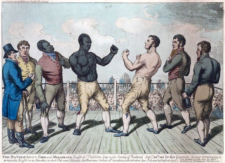
This was the case with Tom Molineaux, seen here ready to battle against Tom Cribb in Clash Of The Titans: Cribb vs. Molineaux. Molineaux’s fame as a fighter peaked with his two English title battles against Cribb in both 1810 and 1811. The latter match was watched by 15,000 people, although Molineaux lost both of them. After retiring from the ring, his life from there went downhill, serving time in a debtors’ prison and finally dying at the age of 34 as a penniless alcoholic. It reminds me that as much as we can accept peace and diversity, there are still some underground civilians out there who cannot stand change, Clash Of The Titans being a symbol of damaged pride and rising vengeance. It is not the sort of thing that I like to look at, but I think it is something that people should see so as to remind our future selves to be better individuals.

But there is hope with All At Sea. For many black men who served in the Atlantic region, a life at sea offered much more opportunities and equality than on dry land. In All At Sea, we see a group of white men gathered round a table playing a game, one black man joining them. They all appear to be enjoying themselves, the black man especially, without a care in the world. It may be instantly noticeable that there is only one black guy with them, but considering the way that they all look like they are enjoying themselves, diversity is not as much of a sensitive topic and all these people are accepting one another for being themselves.

Both exhibitions contained interesting histories and individuals concerning black history, although I far preferred No Colour Bar. The way that it was curated and coloured fit the mood that we ought to have got from it, and the tones of each exhibit boosted my artistic value through an array of colours and styles. The Black Cultural Archives, on the other hand, was more of a history lesson than something I could pick up artistic inspiration from, so naturally I lost interest when it came to picking up ideas from it.

Sources:

No Colour Bar: Black British Art In Action [exhibition], Guildhall Art Gallery, Moorgate, 30th Sep 2015


Black Georgians: The Shock Of The Familiar [exhibition], Black Cultural Archives, Brixton, 13th Oct 2015

Clash Of Cultures (1/2)

“No Colour Bar” was a banner slogan for the international struggle against racism that was erupting throughout the 20th century, beginning with the civil rights movement in North America. An exhibition of the same name is being held at the Guildhall Art Gallery, featuring many black artists from the time such as Errol Lloyd and Tam Joseph, many of which migrated into England in the late 50s. 

The introductory piece that caught my eye straight away was Lost Queen Of Pernambuco, an alloy bust produced in 1989 by Fowokan George Kelly. Pernambuco refers to a settlement of Africans who, across the 18th and 19th century, escaped their slavery and lived as a community on the border of Brazil and Dutch Guiana. They lived their for 90 years, only to be captured again for their apparent lack of vigilance.
The term Queen is often used for idolatry purposes, as if the Pernambuco settlement somehow worships this figure portrayed as a bust. For what reason we are not initially clear, but when the title states that they are the lost queen, I am given the implication that it is something that they were trying to find but never could. I get the impression that the Pernambuco each had something they could look up to and idolise…something to keep them going and working hard. Kelly may have been trying to give off the implication that they were all human, and that we could empathise with them, the bindings around the bust reiterating slavery whilst the title of Queen implicating dominance and idolatry.

Once I entered the room where the bulk of the exhibition was taking place, everything seemed to brighten up some more. The artwork now felt less gloomy and less depressing, and more carefree and innocent. The curator may have been trying to say that, on the outside things may seem scary, but if we actually delve into new different cultures, it could actually prove to be potentially exciting. 

As was the case with Rain Falling, Sun Shining by Odette Thomas, this front cover of the book illustrated by Errol Lloyd. Thomas’ biography at the back of this book says that it contains rhymes written for and to be read and sung by children, the pictures illustrating some of Thomas’ fondest childhood memories. As such, Lloyd’s front cover is colourful and peace-provoking, portraying a young black child interacting with some vibrant wildlife. Referring back to my analysis of the curation, I now have a much better, more positive impression on African culture, as it seems to me that they are peace-loving and innocent, wanting to avoid segregation and make their way in the world, just like us. The title, Rain Falling, Sun Shining further enhances my impression of positivity, the sun being verbalised to be more superior to the commonly bad and dark rain.

Another book cover that caught my attention was a photograph by Jerome Liebling, the book being Andrew Salkey’s In The Border Country and Other Stories. The photograph portrays an elderly man taking a rest in what look like grassy plains. This man does not look of any black descent or origins, and the grin on his face tells us that he is very content resting in this wasteland. In The Border Country could well be a reference to the border of Brazil and Dutch Guiana where the Pernambucos escaped to, although the content look on the model’s face contradicts that of the lost queen. I admire this photo for it’s simplicity, reminding us that new cultures can be a refreshing and vibrant experience. 

Delving further into the exhibition drove me to Tam Joseph’s Spirit Of The Carnival. A screen print produced in 1988, Spirit Of The Carnival offers a political commentary on increasing police presence at London’s annual Notting Hill Carnival of the time. A character at the centre of the piece, adorned with traditional African tribe clothing, is cornered by riot shields, along with their dog. I liked this piece for it’s spontaneous action and movement, provoking a dynamic sequence that could escalate in any direction. The character surrounded by the vast wave of policemen is described as being a “Defiant Masquerader”. This name, I think, gives them more of a persona, as if they are some kind of vigilante. Spirit Of The Carnival has been my major influence on generating ideas for my A6 postcard, for it’s portrayal of what so far I have seen as a peaceful culture and turning it into more of a tense and dangerous realm.


Also bright, colourful and somewhat abstract in composition was Witchdoctor by Denzil Forrester. Forrester came to England from Grenada when he was a mere 10 years old. Witchdoctor is a huge oil on canvas painting that he produced when he was in his late 20s; he often liked to work in a huge scale and much of his work features music and popular culture. Witchdoctor does not contradict, and once again I can appreciate it for it’s dynamic use of colour, it’s innocence, and the impression that it has struck me with on black historic culture.